
The Bryte IQ
Developer Platform
TIMELINE
Fall 2024 - Present
COMPANY
ROLE
UX Lead
INDUSTRY
Telecommunications, Software Development
SPECIALTY
UX Research, UX Design, UI, Strategy
≥1
Additional Enterprise Partners Secured
$Millions
Of Dollars in Additional funding approved by the Board
INTRODUCTION
Bryte IQ is a developer platform that makes it easier for third-party apps to connect to Charter’s internet and mobile networks. It provides developers with secure tools to build new services that interact with the network, like controlling device connections or optimizing streaming quality, without needing to manage the infrastructure behind it.
The platform is based on an open industry standard, which helps ensure compatibility across different companies. The goal of this project is to simplify the API experience through a modern, self-service interface, clear onboarding, and user-friendly tools, resulting in seamless deployment.
MY TEAM
This project was driven by close collaboration across a large, multidisciplinary team. I worked alongside a VP of Product, solutions architect, technical delivery lead, project manager, scrum master, and dedicated front-end, back-end, and API engineers. As the sole UX and visual designer, I partnered closely with engineering leads to align the design vision with technical feasibility. Throughout the process, we worked in agile sprints with regular standups, working sessions, and iterative reviews, ensuring that design decisions were well-informed, technically sound, and strategically aligned with business goals.
RESULTS
700%
Increase in Website Traffic
675%
Increase in Account Registration Requests
RESEARCH & DISCOVERY
Due to confidentiality restrictions, select visuals and content have been redacted or recreated for illustrative purposes. The UX process, design rationale, and results presented are representative of the actual work.
OBJECTIVES
Identify friction points in platform onboarding and API integration
Validate assumptions around developer expectations for platform usability and documentation
Gather input to guide feature prioritization and information architecture.
METHODS
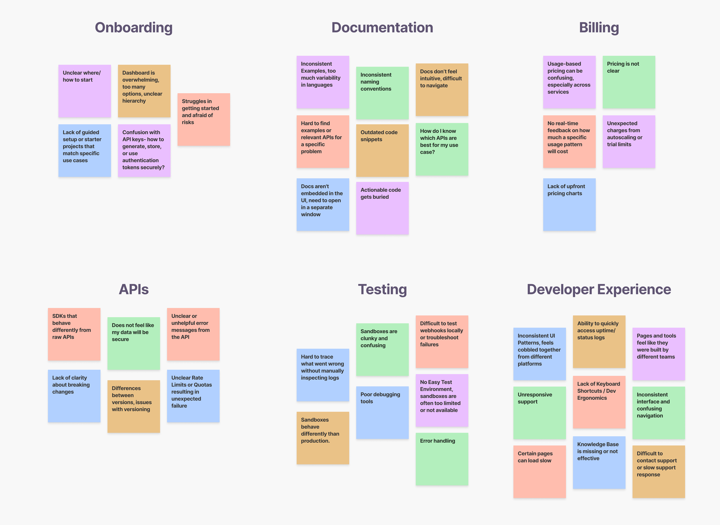
To define the product’s direction, we organized 2 stakeholder workshops to gather formal business and technical requirements. In parallel, we conducted five in-depth developer interviews to gain a deeper understanding of their workflows, pain points, and expectations. We synthesized these developer insights into an affinity map, which helped us identify recurring themes and prioritize user needs in the early design process.

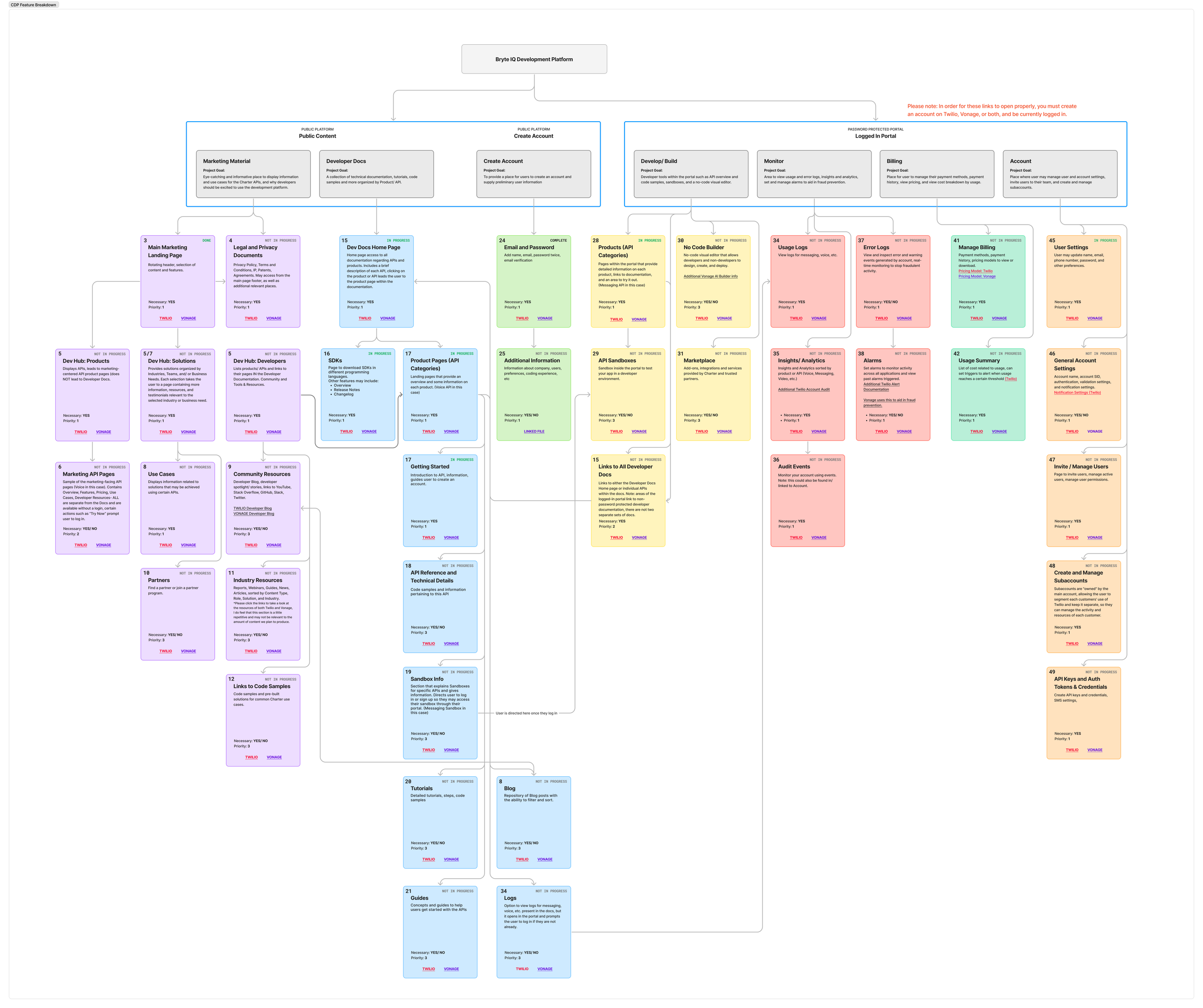
I led a strategic competitive analysis to ensure our platform wasn’t just aligned with industry standards, but stood out as a viable, modern option in a space dominated by established developer tools. This included evaluating features, user experience flows, information architecture, documentation quality and presentation, onboarding friction, visual design, and more. I created a Feature Breakdown Structure to translate these complex platforms into a clear, structured set of common features, making it easier to identify user expectations and design priorities.
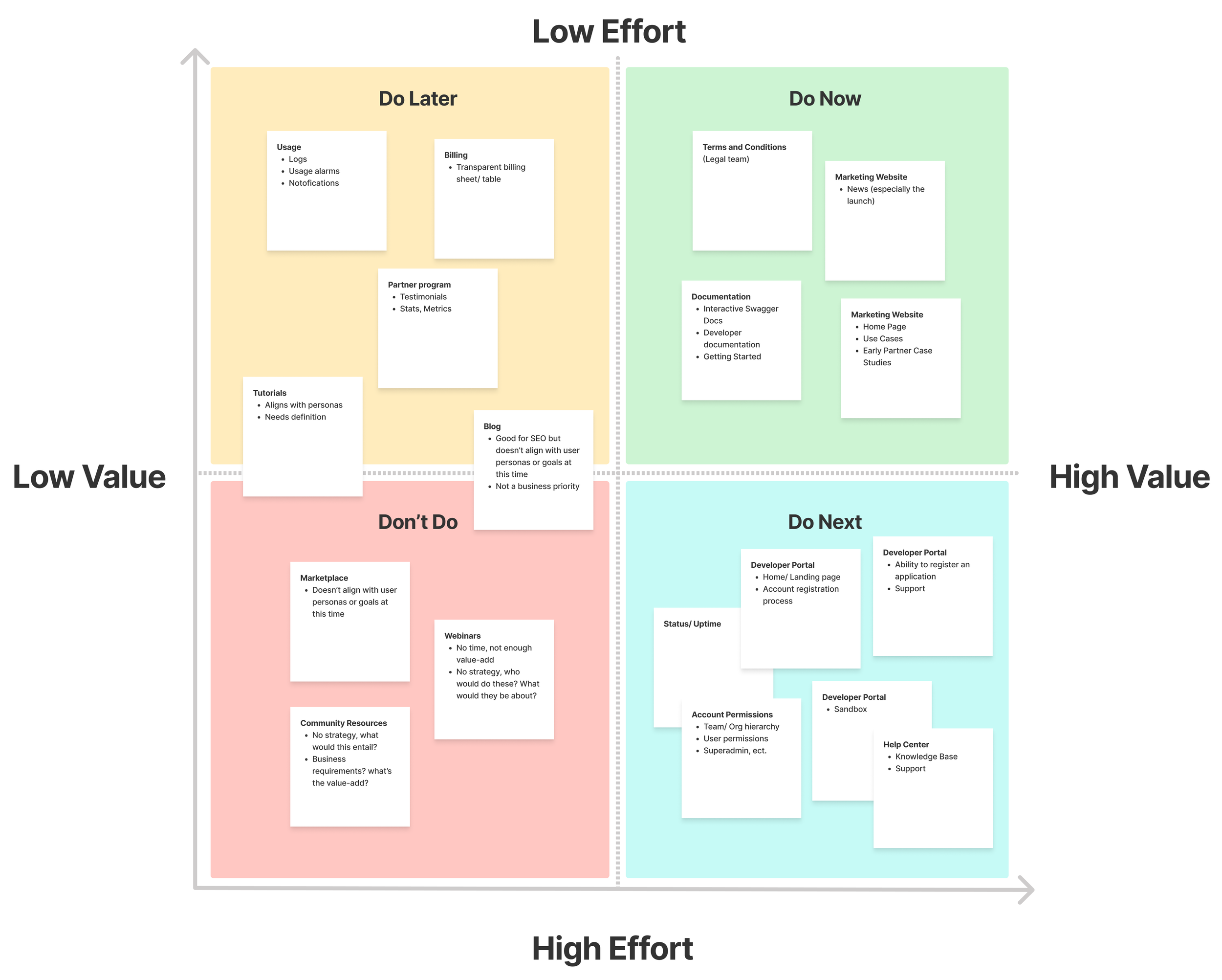
We then applied prioritization frameworks to focus our design and development efforts. Starting with a broad set of potential features gathered from competitive analysis and developer interviews, we cross-referenced each idea against our stakeholder-defined business goals.
Each feature was evaluated for user value, technical feasibility, and alignment with the platform’s core purpose. Through collaborative working sessions, iterative reviews, and various frameworks (MoSCoW, prioritization funnel, 2x2 matrix), we systematically narrowed the scope to a set of high-impact, essential features that formed the foundation of the MVP.

KEY INSIGHTS
ONBOARDING
Observation: Many developers struggled to understand how to get started due to unclear entry points and high-friction registration flows.
Recommendation: Minimize upfront barriers like multi-step registration and unclear token management, and instead focus on simple onboarding that offers immediate value.
TRUST & TRANSPARENCY
Observation: Users were wary of “black box” systems and wanted clear insights into how their apps interact with underlying infrastructure.
Recommendation: We will need to prioritize trust-building UX and transparency regarding user privacy, API behaviors, performance, limitations, and latency to position Bryte IQ as a reliable integration partner.
DOCUMENTATION
Observation: Developers want clear, concise, and contextual documentation with working code samples they can use immediately.
Recommendation: We will need to include real-world use cases, quick-start guides, and inline explanations to meet developers where they are, to reduce ambiguity, and encourage hands-on experimentation without requiring external support.
NAVIGATION
Observation: Developers needed dashboards that helped them navigate their applications, manage their team, quickly locate errors, test changes, and prepare apps for deployment.
Recommendation: We will need to create a centralized, permission-based navigation system that streamlines access to tools, documentation, and API metrics to increase efficiency and reduce frustration.
CORE USERS
We developed our personas based on qualitative data gathered from the 6 developer interviews and 2 stakeholder workshops, supported by insights from a comprehensive competitive analysis. These personas helped align design and engineering teams around the needs of both enterprise developers and non-technical decision makers.


UX GOALS & DESIGN OBJECTIVES
Key user behaviors, pain points, and opportunities were translated into clear design goals and experience principles that shaped our direction as we moved into concept development, laying the foundation for iterative design and usability testing.
DESIGN GOALS
Streamline Developer Onboarding
Reduce time and cognitive load for new users to understand and start using the platform.
Enable Seamless Navigation
Create a clear central hub with intuitive pathways, accessible documentation, and responsive feedback to support confident, self-guided use.
Accelerate Exploration & Adoption
Empower developers to independently discover, test, and integrate platform features without unnecessary friction or dependencies.
Create a Cohesive, Scalable Design System
Ensure UI consistency, reusability, and accessibility across both the marketing site and the Developer Portal.
EXPERIENCE PRINCIPLES
Clarity Over Complexity
Prioritize directness, plain language, and intuitive structure, especially for complex technical content. Users should never be surprised by platform behavior; consistency builds credibility.
Empower Through Feedback
Give real-time, contextual feedback to help users understand the outcome of their actions (e.g., error states, confirmations, follow-up emails).
Trust and Predictability
Build user trust through transparent authentication flows, clear permission scopes, and reassuring feedback that communicates protection without overwhelming the experience.
THE SOLUTION JOURNEY
PHASE 1: MARKETING WEBSITE MVP
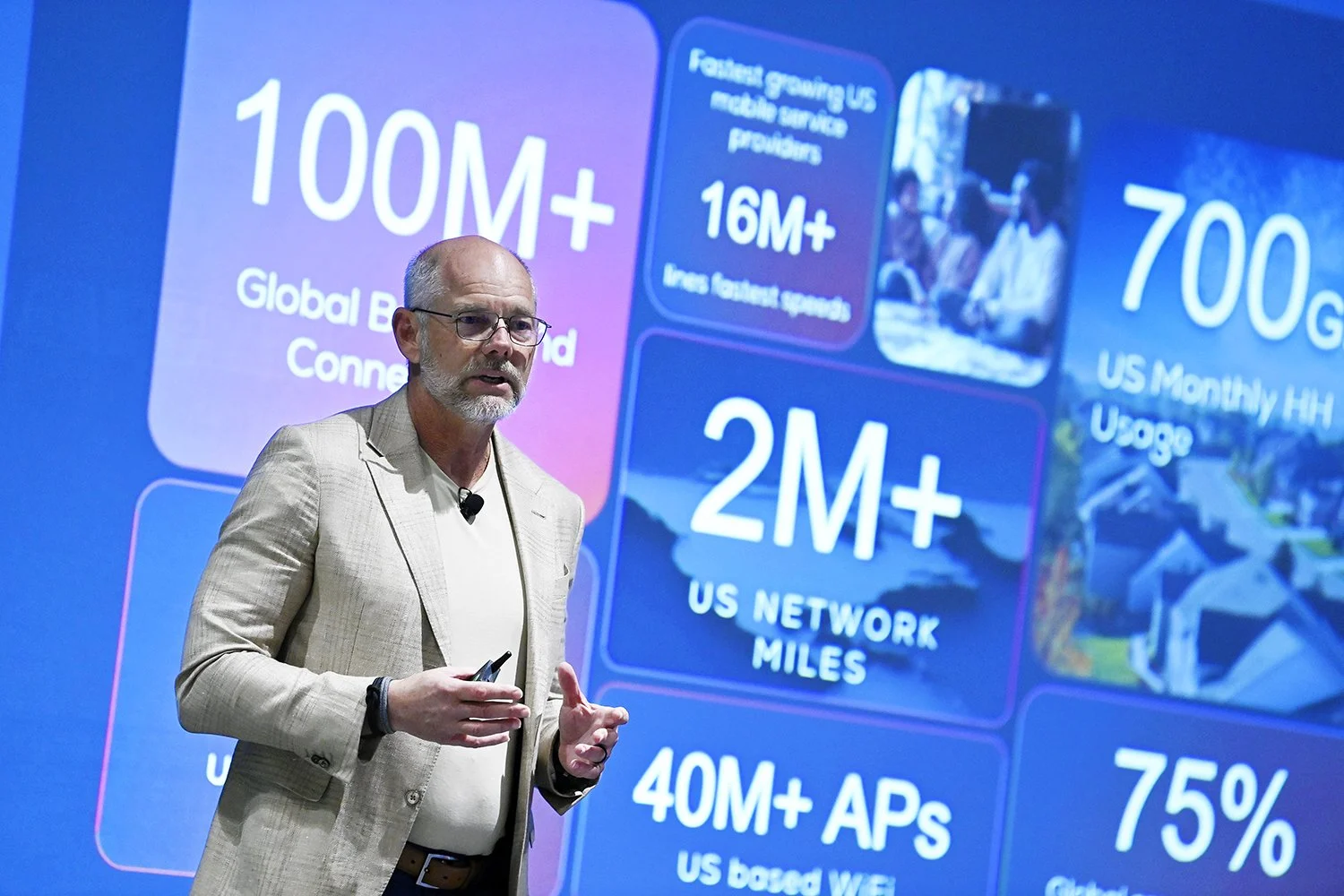
Phase 1 focused on the marketing side of the platform, designed to generate early interest and secure buy-in from business decision makers. This initial launch prioritized storytelling, visual polish, and clear articulation of the platform’s value, key factors in aligning stakeholders and attracting early partnerships. Bryte IQ was presented on stage at SCTE TechExpo 2024 by Danny Bowman EVP of product at Charter Communications, who highlighted its innovative capabilities and how it will facilitate collaboration with other companies on behalf of the customer. (Press Release) Once Phase 1 achieved its goal of market visibility and executive support, we rapidly transitioned to Phase 2: the Developer Portal.
PHASE 2: DEVELOPER PORTAL MVP
Phase 2 prioritized functionality, clarity, and a streamlined user experience tailored to the technical audience. This phased approach allowed us to build early momentum while keeping the long-term developer experience at the center of our roadmap. The production goal of mid-July was met successfully.
Due to confidentiality restrictions, select visuals and content have been redacted or recreated for illustrative purposes. The UX process, design rationale, and results presented are representative of the actual work.
PHASE 1
USER JOURNEY STRATEGY AND STRUCTURE
While the initial navigation plan included a broader set of features, we collaborated closely with stakeholders in working sessions to distill it down to only the most essential elements for the MVP. This intentional simplification enabled us to launch quickly with a polished experience that fostered executive buy-in and increased market visibility.
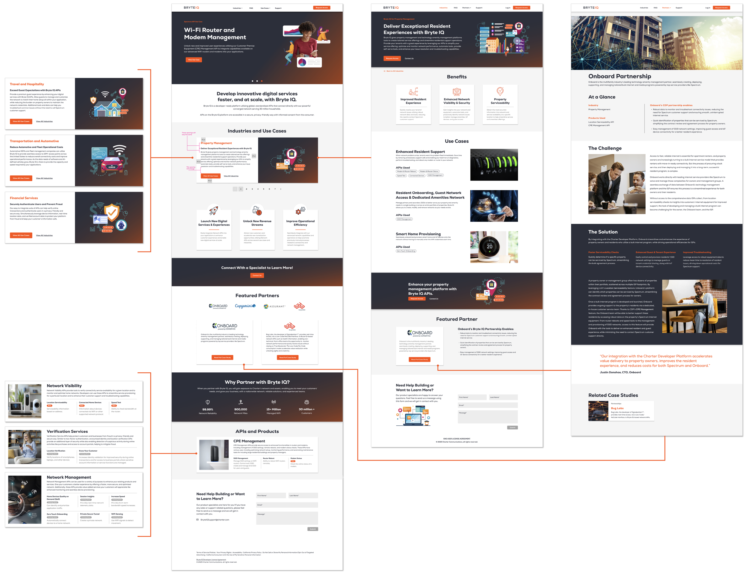
To drive early engagement and align cross-functional stakeholders, I defined an experience flow for the marketing site that articulated Bryte IQ’s value proposition with clarity and intent. The approach focused on guiding non-technical audiences through a structured narrative that translated complex platform capabilities into clear, strategic benefits.


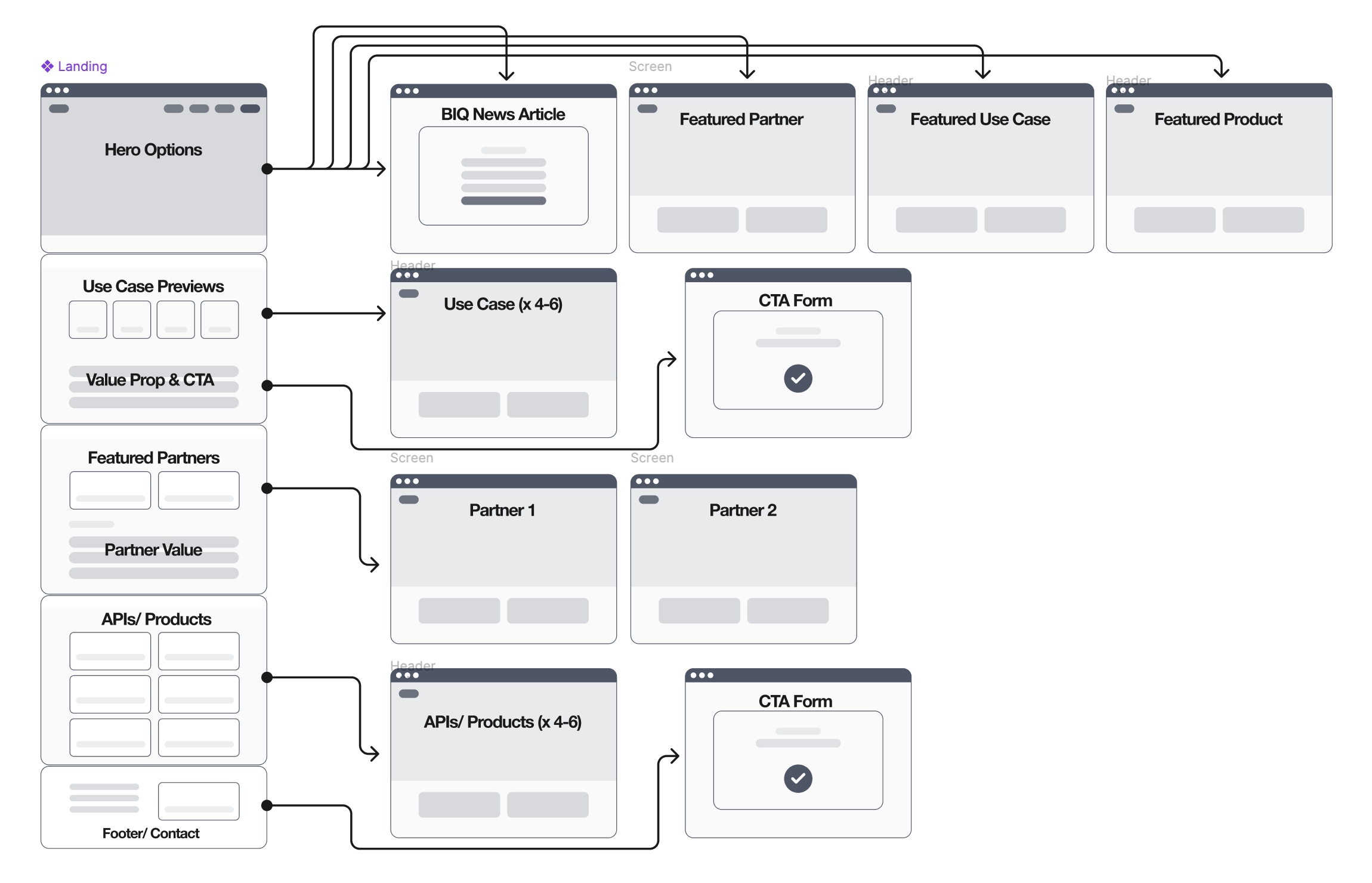
I defined the homepage experience to establish a clear narrative, visual hierarchy, and intentional entry points within the primary user flow. The structure was designed to guide non-technical audiences from high-level value propositions into deeper exploration with minimal cognitive load. The case study experience emphasized real-world outcomes, using customer examples and partnerships to substantiate the platform’s value.

HOME PAGE

CASE STUDY


SCALABLE COMPONENT FRAMEWORK
To ensure consistency and scalability across the Bryte IQ platform, I created a modular design system tailored to the brand’s voice and technical requirements. Externally, it delivered a polished, cohesive experience that built trust with customers and aligned with Bryte IQ’s visual identity. Internally, the design system met our played a critical role in:
Accelerating our workflow
Streamlining decision-making
Reducing redundant design work
Making developer handoff far more efficient.
By standardizing components, states, and patterns upfront, we minimized ambiguity, improved collaboration between design and engineering, and laid the groundwork for future iterations across both marketing and developer-facing tools.
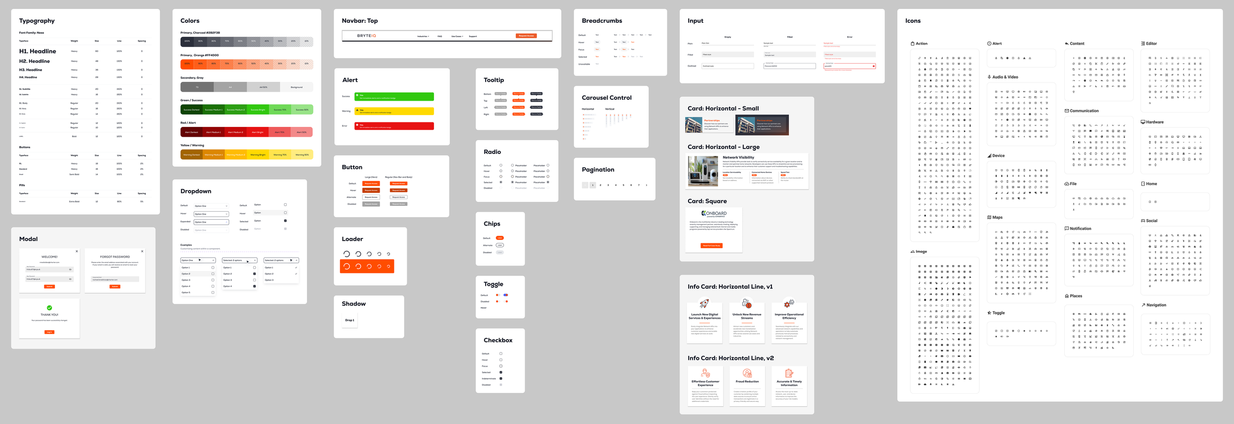
VISUAL NARRATIVE
In addition to the standardized design system, I established a cohesive illustration and iconography language to reinforce Bryte IQ’s brand and translate complex technical concepts into accessible, value-driven narratives. This visual system strengthened storytelling and enabled non-technical stakeholders to quickly understand key value propositions. Designed for scalability and consistency, the system aligned with principles of clarity, trust, and simplicity, elevating the overall experience while improving content comprehension across the marketing site.


END-TO-END EXPERIENCE PROTOTYPE
With the foundation grounded in research, strategic prioritization, and a scalable design system, I translated the Bryte IQ vision into an interactive experience model. This interactive prototype offered a realistic preview of the end-to-end experience and served as a critical alignment tool for stakeholders, enabling early usability feedback, design validation, and seamless transition into development.
LAUNCH AND RESULTS
LAUNCH
Bryte IQ was officially launched at the SCTE TechExpo in Atlanta in September 2024 by Charter EVP of Product, Danny Bowman. He described Bryte IQ as “a significant leap forward, simplifying the process for developers, fostering a vibrant ecosystem of innovative services.”
RESULTS
Website traffic climbed from around 40 visits in the first week to over 300, a 700% increase that reflected heightened interest and engagement following our announcement.
Similarly, the number of account registration requests surged by 675% following the launch at SCTE TechExpo, signaling strong interest among developers.
Onboard, an early partner, integrated Bryte IQ to streamline bulk internet services in multifamily housing, demonstrating the platform’s potential to drive operational efficiencies and enhanced customer experiences.
Secured additional strategic partnerships to expand platform adoption (details under NDA).
PHASE 2
DEVELOPER PORTAL
The authenticated portion of the Bryte IQ platform was designed to support developers as they onboard and create applications by selecting APIs. After logging in, users land on a personalized dashboard that provides important information and useful links at a glance. From there, the user flow guides them through the application registration process, organized within a modular, scalable interface (User Flow shown in diagram below)
This experience aligns with our design goals of Enabling Seamless Navigation and Accelerating Exploration & Adoption by emphasizing clarity, contextual guidance, and reducing cognitive load through phased visibility. This phase of the project involved close collaboration with internal stakeholders and developers to ensure the platform’s UX aligned with real-world technical workflows while supporting system requirements and implementation limitations.
Due to confidentiality restrictions, I am unable to show the UI behind login or discuss the feature or architecture design in detail.

TESTING AND ITERATION
INCORPORATE FEEDBACK
With limited access to external users during the development of the Phase 2 authenticated dashboard, we conducted focused usability sessions with a small group of early committed partners and internal subject matter experts. These sessions included website walkthroughs and scenario-based tasks to validate core workflows, identify friction points, and uncover gaps in the user experience.
FEEDBACK
API documentation felt buried and hard to find from the main navigation.
ACTION
Introduced a persistent link in the left nav with subcategories leading directly to the API in question. Overcame technical constraints to prevent the documentation from opening in a separate tab.
OUTCOME
Increased documentation access during setup sessions by 55%.
Users were unclear on how to start integrating APIs after login.
Added a prominent “Getting Started” module on the main dashboard with direct links to key setup tasks.
Reduced time-to-first-action from an average of 3 minutes to under 1 minute in internal tests. Improved developer confidence, efficiency, and mood.
Developer Docs felt disjointed and difficult to follow.
Conducted a full audit of the developer documentation to remove outdated content, improve overall structure, and add supporting diagrams.
Decreased set-up time and lowered support requests related to setup and configuration.
FUTURE GOALS
WHATS NEXT?
Our team has a clear roadmap to evolve the platform in ways that deliver greater value to users and align with business objectives. In the near term, we’ll roll out Dark Mode as an accessibility-driven quick win and introduce status monitoring to give users real-time visibility into integration health.
Building on feedback uncovered during user research, we will also implement flexible user management and team-based collaboration, enabling organizations to structure role and permission-based workflows that support seamless collaboration across teams.
Looking back at our design goal to Accelerate Exploration & Adoption, advancing automation will play a central role in our strategy. To empower self-service and reduce friction, we’ll launch a Help Center with an integrated Knowledge Base and provide a streamlined process for support ticket submission.
From a business standpoint, upcoming releases will introduce a monetization strategy with transparent billing and a usage dashboard, giving organizations greater insight and control over API consumption. Together, these enhancements are designed to strengthen user trust, drive adoption, and ensure the platform scales effectively to meet enterprise-level demands.
