User-Focused Rebrand
ROLE
UX Lead
COMPANY
SPECIALTY
User Research, Branding, Graphic and Website Design
INDUSTRY
eLearning, Online College Education
INTRODUCTION
When two leading EdTech companies merged to form Science Interactive, the challenge went far beyond designing a new logo, it was about earning the trust of professors and students while uniting two very different company cultures. As design lead, I spearheaded a user-focused rebrand that blended research, strategy, and cross-functional collaboration to shape a cohesive identity. This rebrand extended past visual design; we consolidated multiple websites, streamlined content libraries, and reimagined the digital platform into one seamless experience. The result was a brand system that not only looked unified, but also elevated usability, strengthened credibility in higher education, and positioned Science Interactive as the leader in at-home science curriculum nationwide.
MY TEAM
I led the rebrand as design lead, guiding UX research, design strategy, and cross-functional alignment across product, marketing, and sales. By facilitating workshops and translating user insights into clear design rationales, I built consensus quickly, cutting revision cycles by 30% and securing faster executive approval. Partnering with graphic design and multimedia teammates, we ensured the brand met user needs, streamlined internal workflows, and achieved rapid adoption across the organization.
TIMELINE
2019 - 2020
GOALS
DESIGN GOAL
To cut through the sea of established institutions by delivering a brand that stands out and embodies a truly modern educational approach.
BUSINESS GOAL
To transform at-home science education by delivering lab experiences that drive learner engagement, improve comprehension, and increase retention for digital education providers.
COMPANY GOAL
To transform our internal merger challenges into collective strength by rallying all employees around a brand we can feel proud to represent.
RESEARCH AND DISCOVERY
USER IMPACT GROUPS
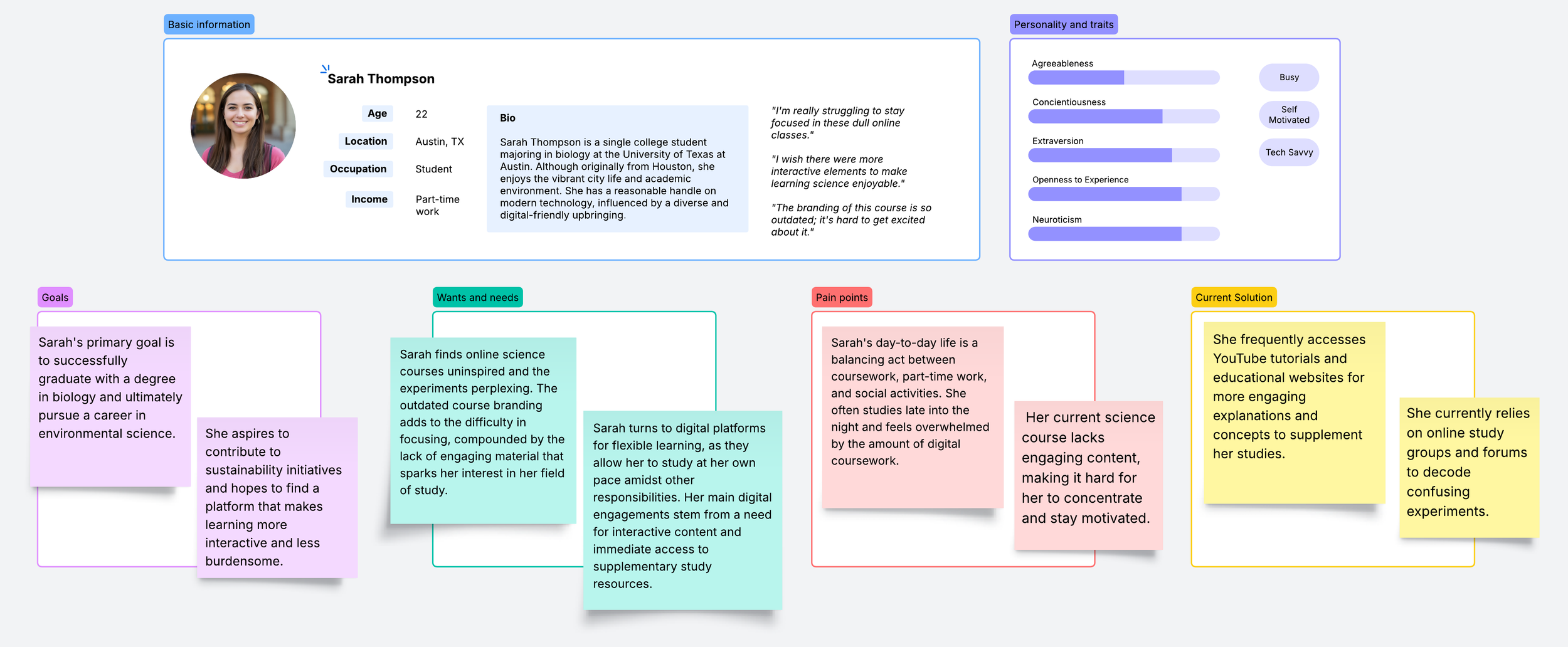
Our user-centered rebrand demanded deep audience insights. We deployed comprehensive qualitative and quantitative research across three key stakeholder groups: Students, Instructors, and Administrators. Through targeted surveys and in-depth interviews with volunteers from each segment, we uncovered critical user needs and pain points. We triangulated these findings with support ticket analysis and sales team insights, identifying recurring themes that shaped our entire brand strategy.


BRAND CONTEXT AND OPPORTUNITY
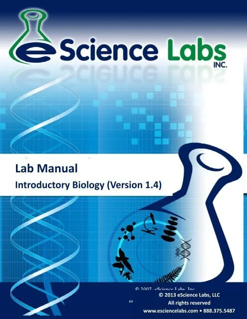
Our competitive analysis revealed a stark truth: both legacy brands were invisible in a sea of generic Ed-tech logos, most of which were a varying shade of blue. To lead this industry, we needed bold visual differentiation. In addition to the external Ed-tech landscape, we audited our internal course materials, and the case for dramatic transformation became undeniable.

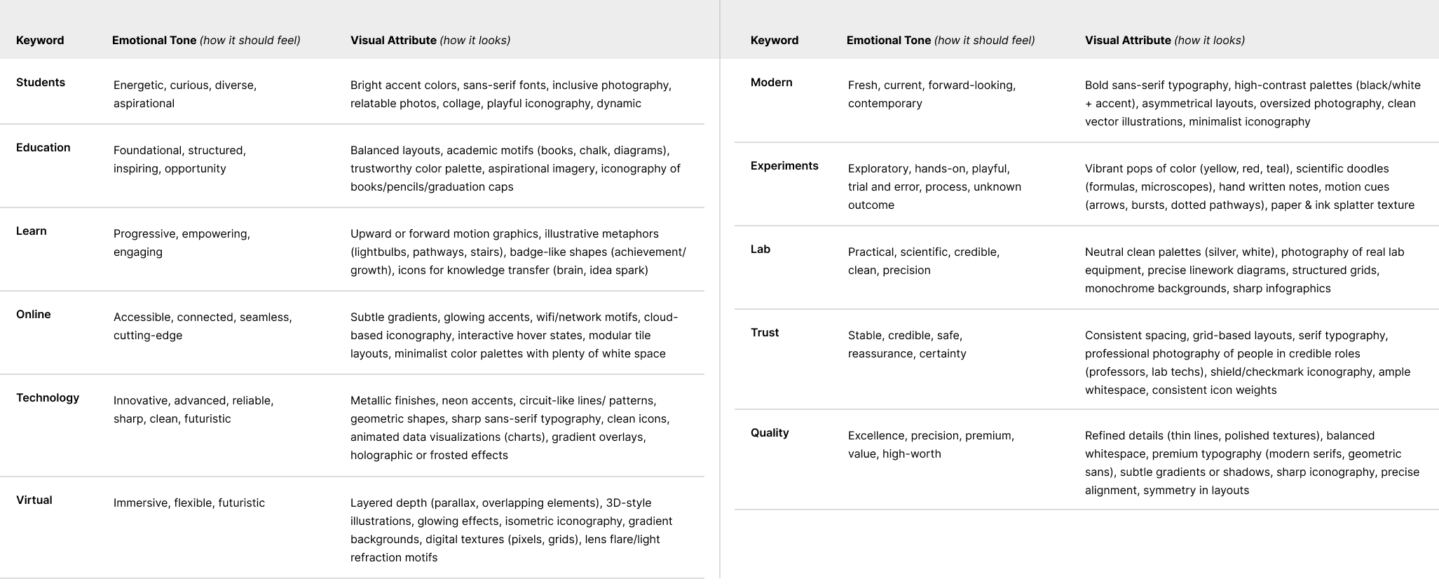
EXTRACTING KEY THEMES
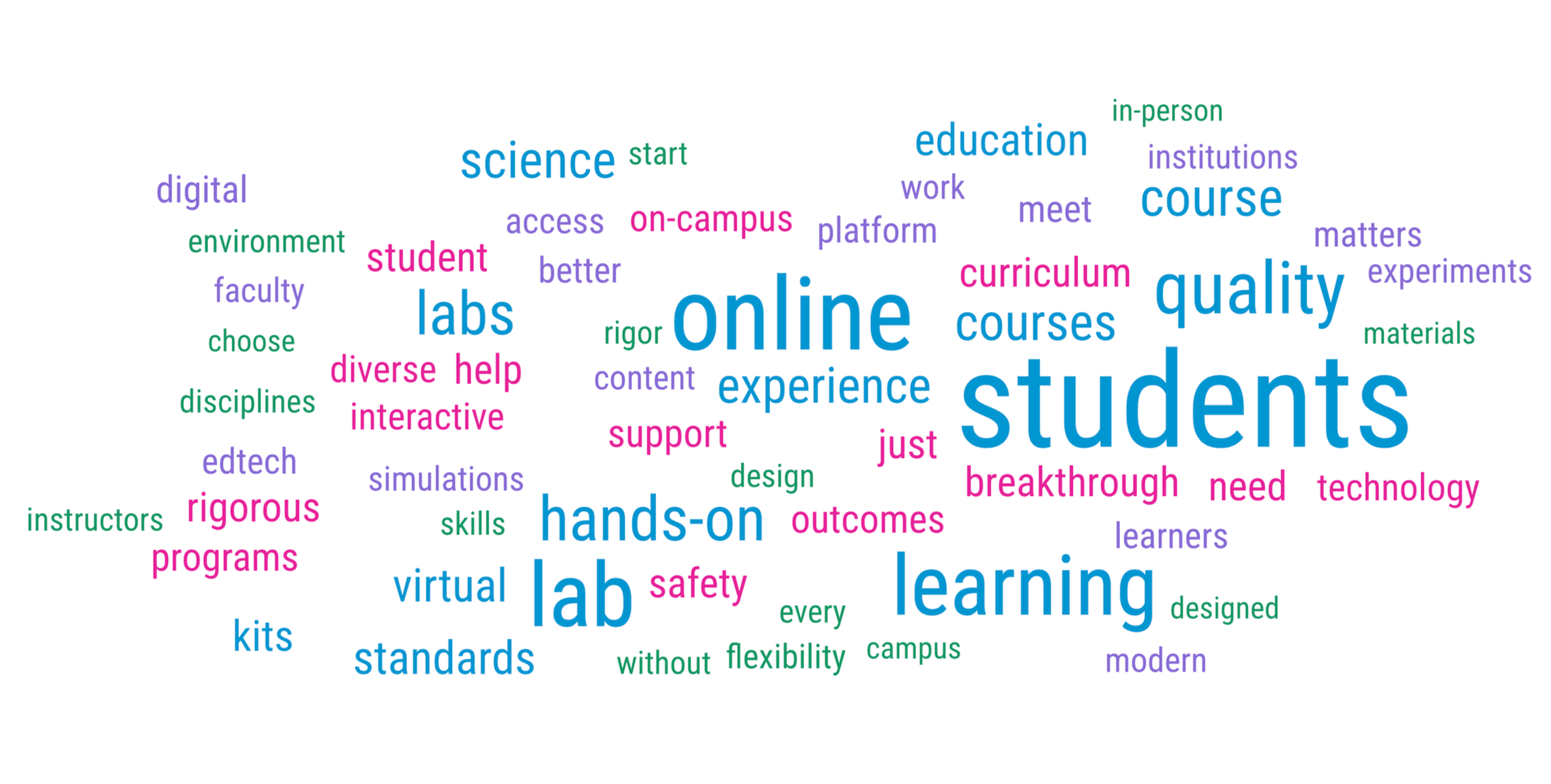
We distilled raw research into creative direction by identifying recurring themes across user interviews, surveys, and support feedback. From this analysis, we uncovered the emotional and functional keywords that shape meaningful learning experiences for professors and students. By clustering these words and translating them into visual attributes, we built a design system grounded in user motivations and aspirations, ensuring the new identity resonated both intellectually and emotionally.

EXECUTION
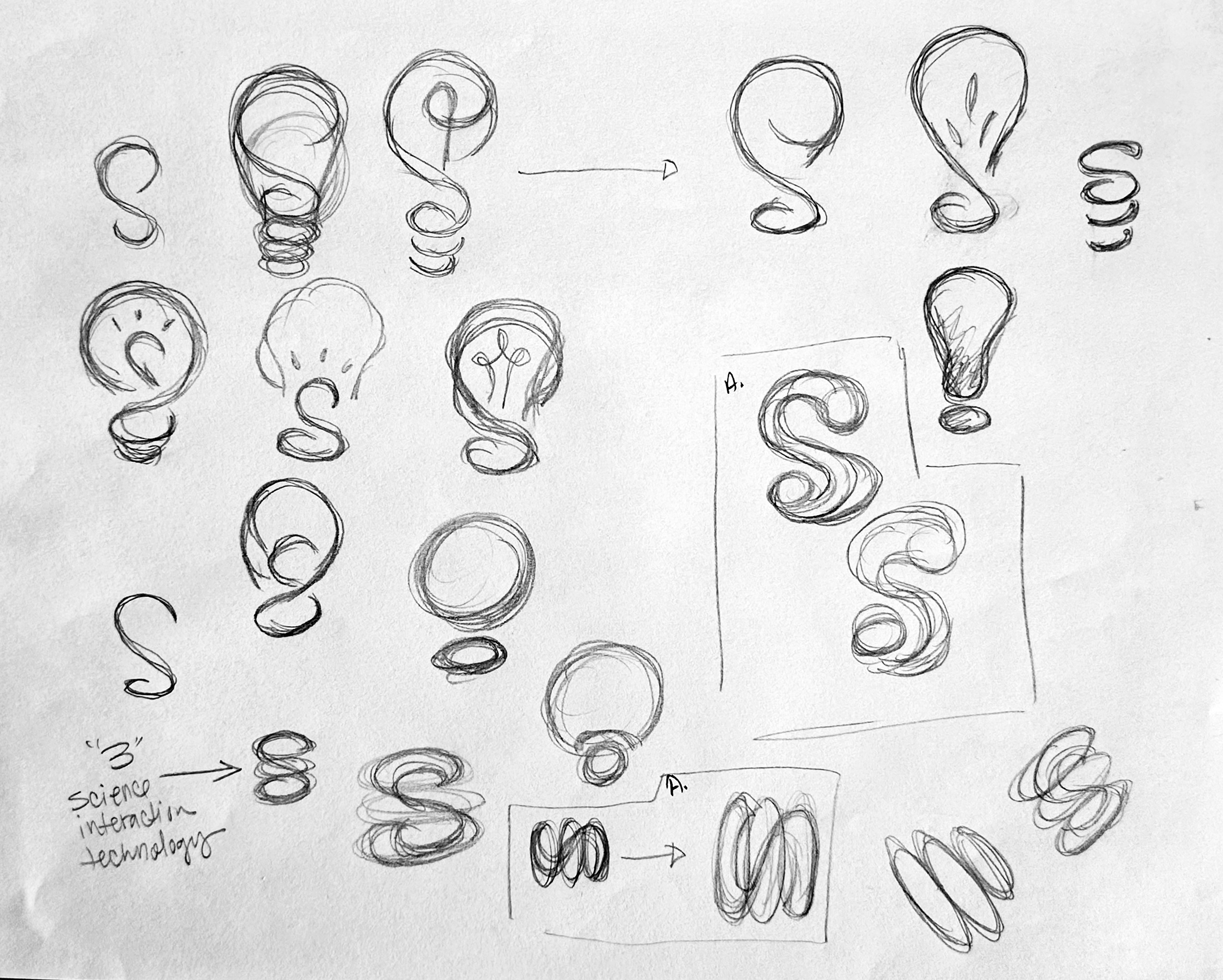
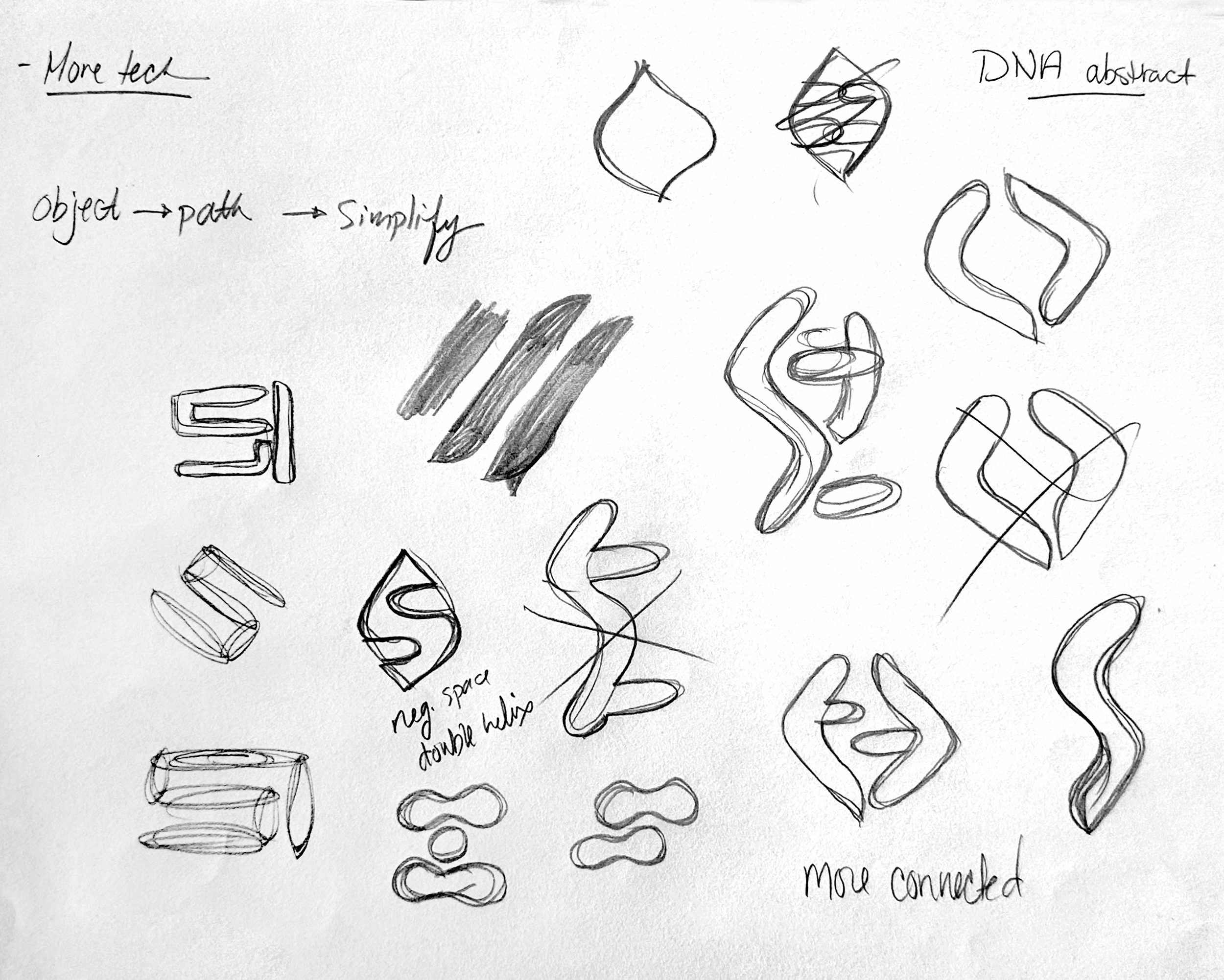
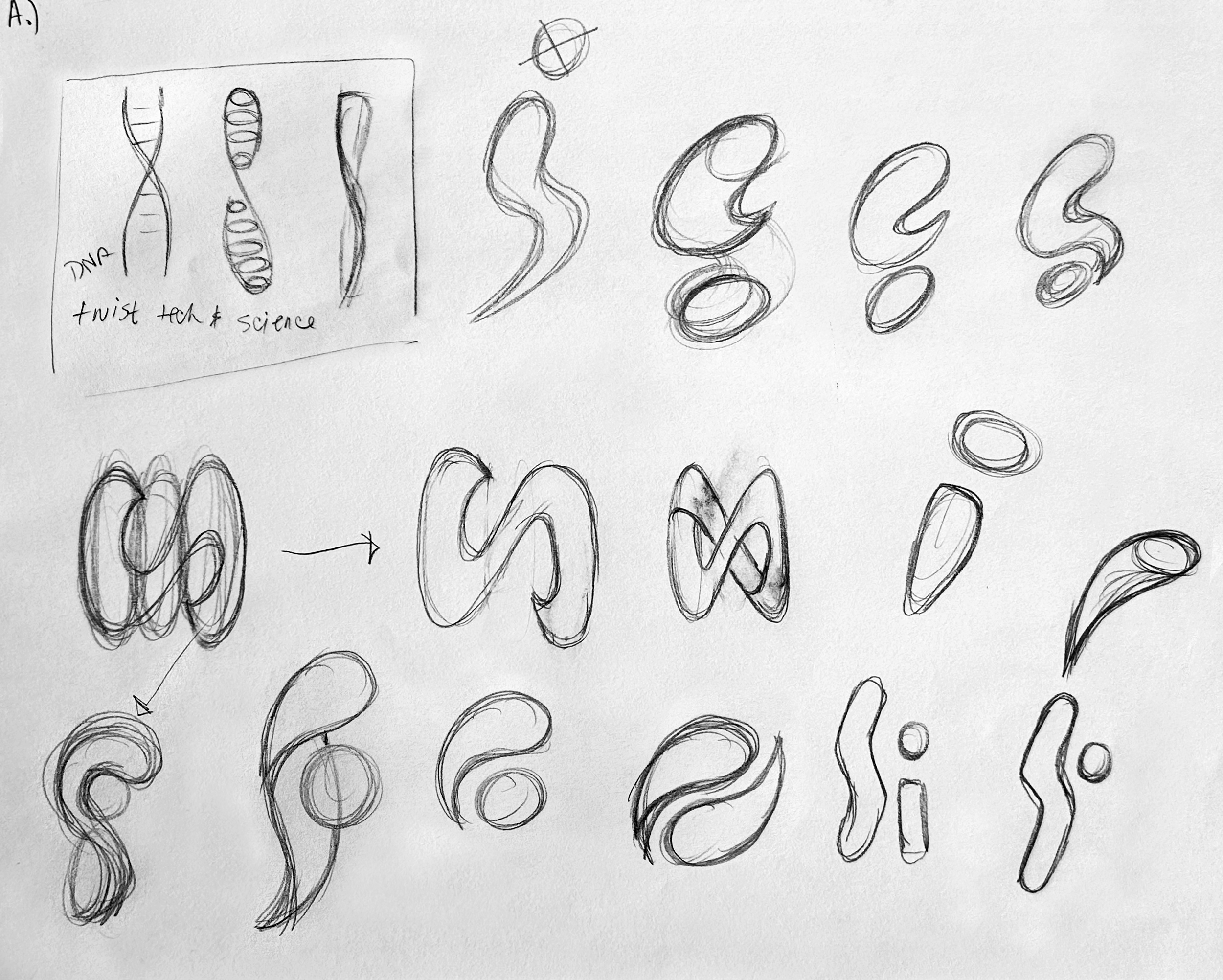
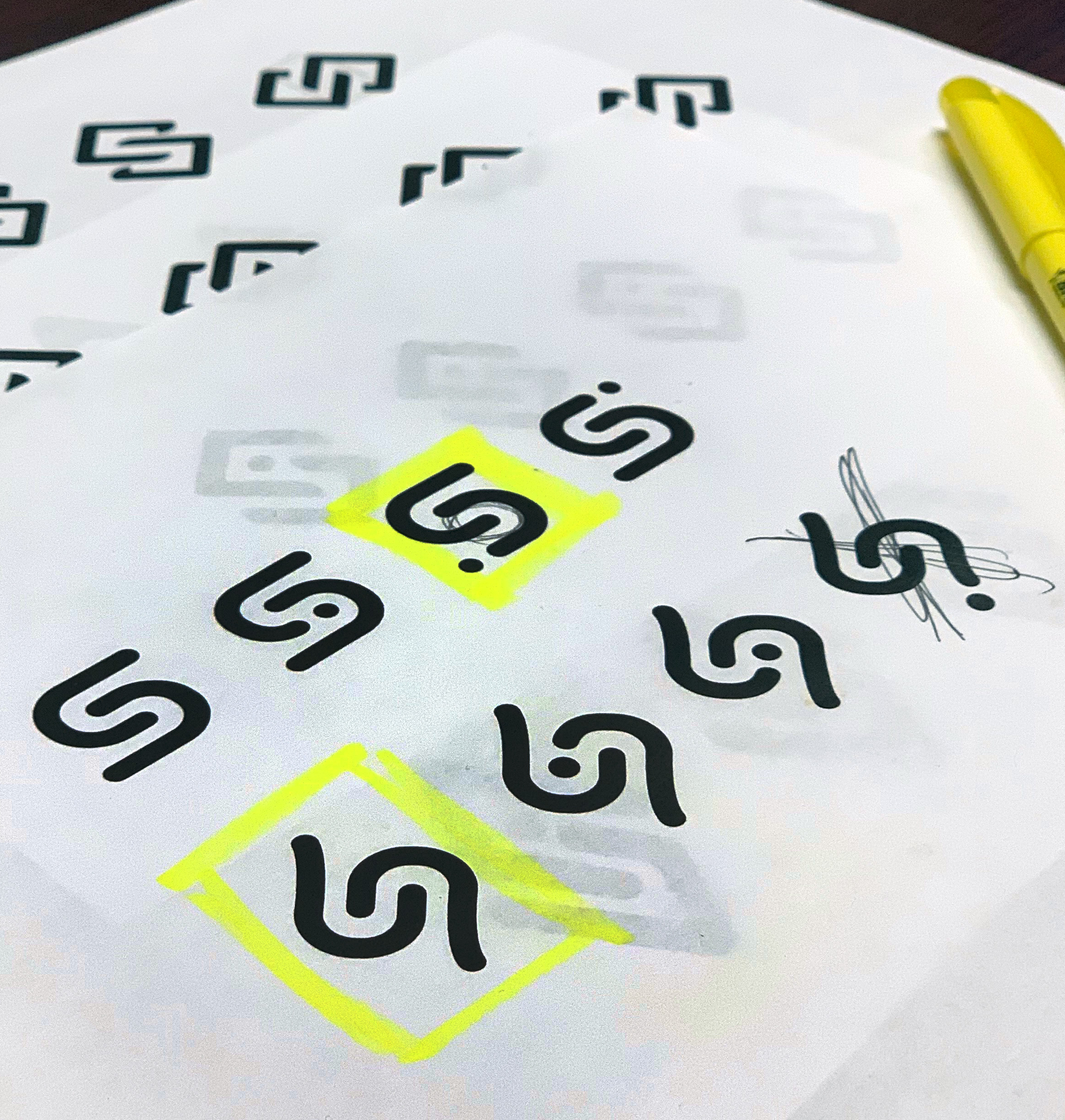
DEFINING THE BRAND SYMBOL
Our identity exploration moved beyond conventional science imagery to create a mark rooted in progress, technology, and discovery, capturing the moments of insight that define impactful learning.

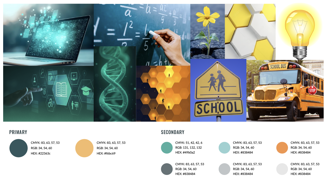
POSITIONING THE BRAND THROUGH COLOR
Our competitive analysis revealed that many education brands default to conservative, blue-heavy palettes that communicate credibility but often feel distant and interchangeable. To intentionally differentiate, we defined a color system that strikes a balance between rigor and momentum. Teal serves as the foundation of the palette, reinforcing trust and precision while bridging the physical rigor of lab work with modern, digital learning environments. A bold, contrasting accent color introduces energy, curiosity, discovery, and progress. Together, these choices position Science Interactive as a new generation of science education, one that delivers a safe, trustworthy lab experience wherever learning takes place.
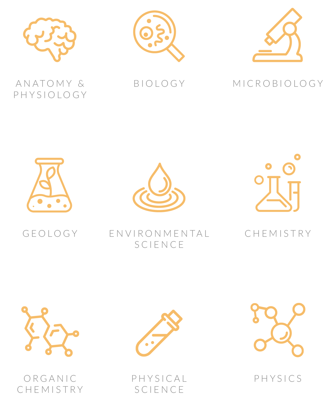
SCALABLE ICONOGRAPHY
We crafted a series of icons and illustrations to extend our flame-inspired brand energy through friendly, dynamic visuals that break away from sterile educational imagery. We embraced bold, simplified forms with high contrast and organic curves that bring a touch of whimsy to the brand and create approachable, human connections.


THE FINAL BRAND
UNITING TEAMS THROUGH BRAND ADOPTION
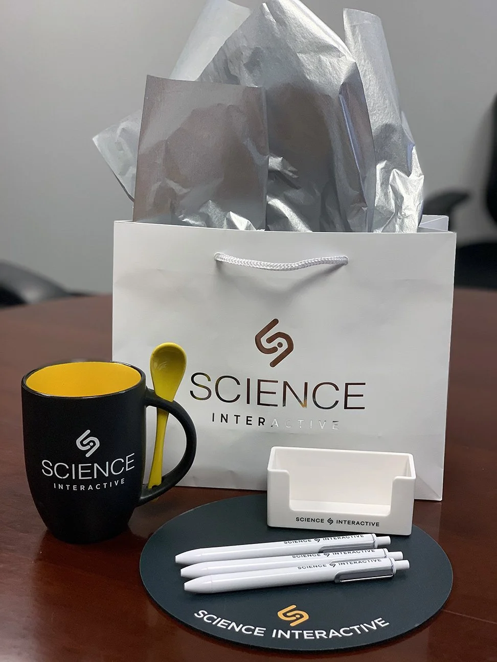
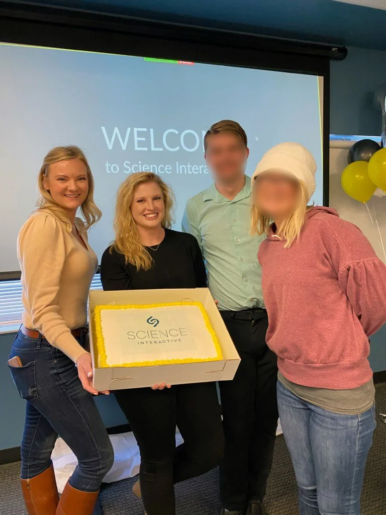
Because this new brand represented a pivotal moment in uniting two previously separate organizations under one shared identity, we decided to reveal the new brand with cake and new swag. Our coworkers not only saw the new logo and colors but also experienced the brand as a symbol of pride and belonging. This moment of celebration helped ease the lingering tensions of the merger, boosted morale, and created a sense of ownership around the new Science Interactive identity. It marked the shift from “two companies coming together” to “one team moving forward.”
APPLICATIONS
NAVIGATION STRATEGY
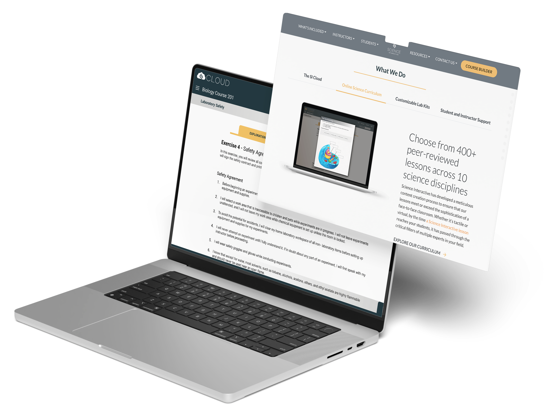
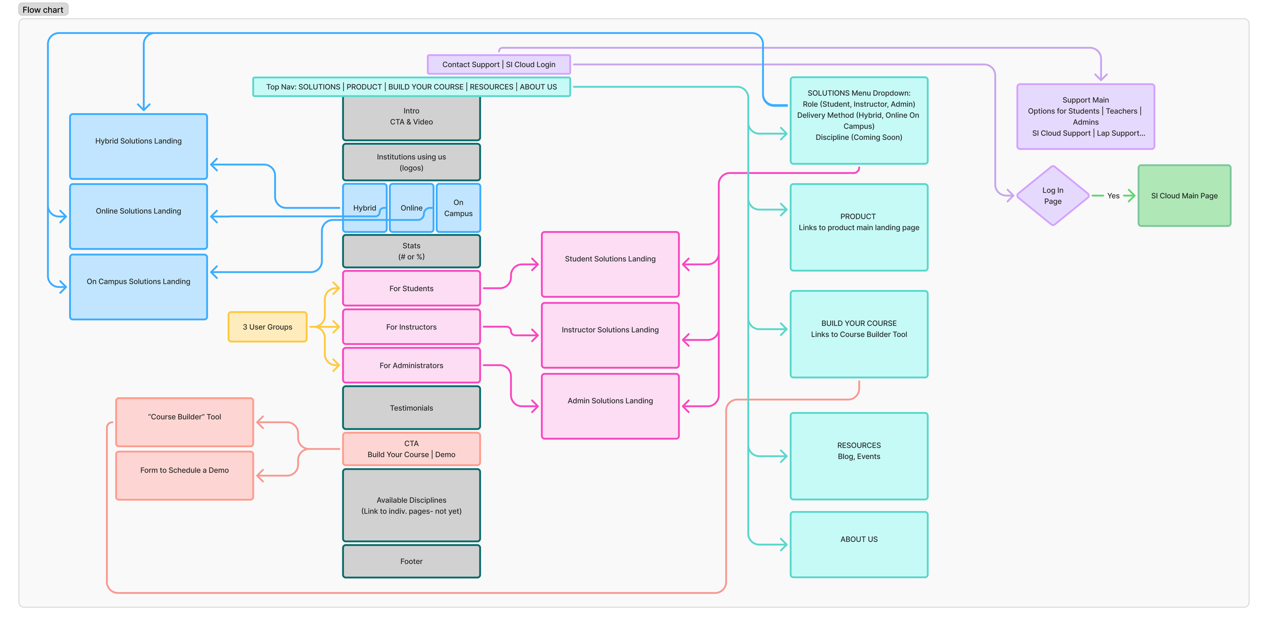
The website redesign focused on creating a clear, scalable navigation system that unified previously fragmented content and made it easier for users to find what they need quickly and confidently. Grounded in user research, we restructured the site architecture and navigation to reflect how students and educators think about labs, courses, and resources, reducing cognitive load and supporting intuitive navigation across the experience. This foundational work established a flexible framework that could evolve alongside the brand and product offerings, ensuring long-term consistency as Science Interactive continued to grow. Take a look at how Science Interactive has progressed while building upon our foundation by viewing their current website: https://www.scienceinteractive.com/
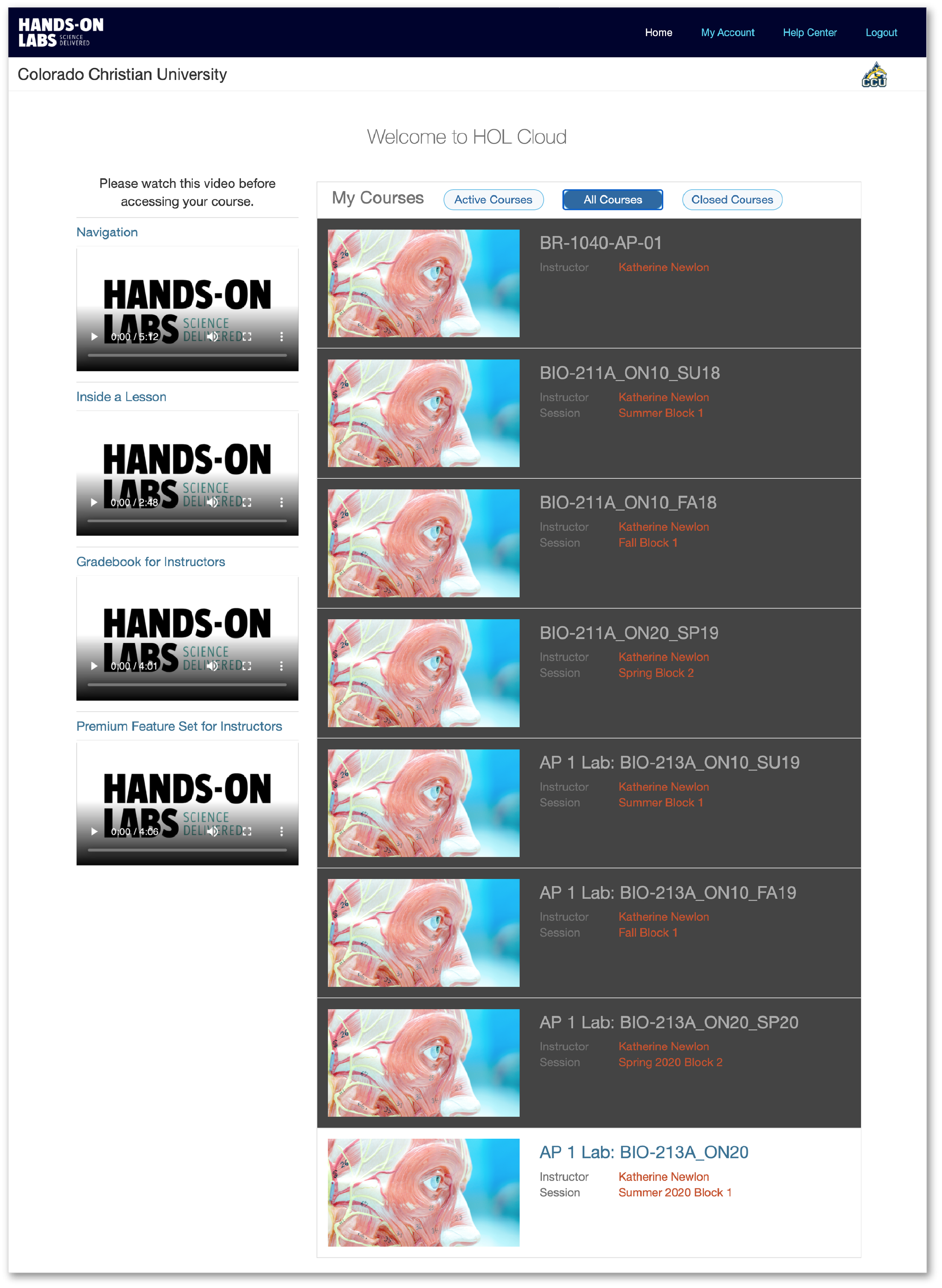
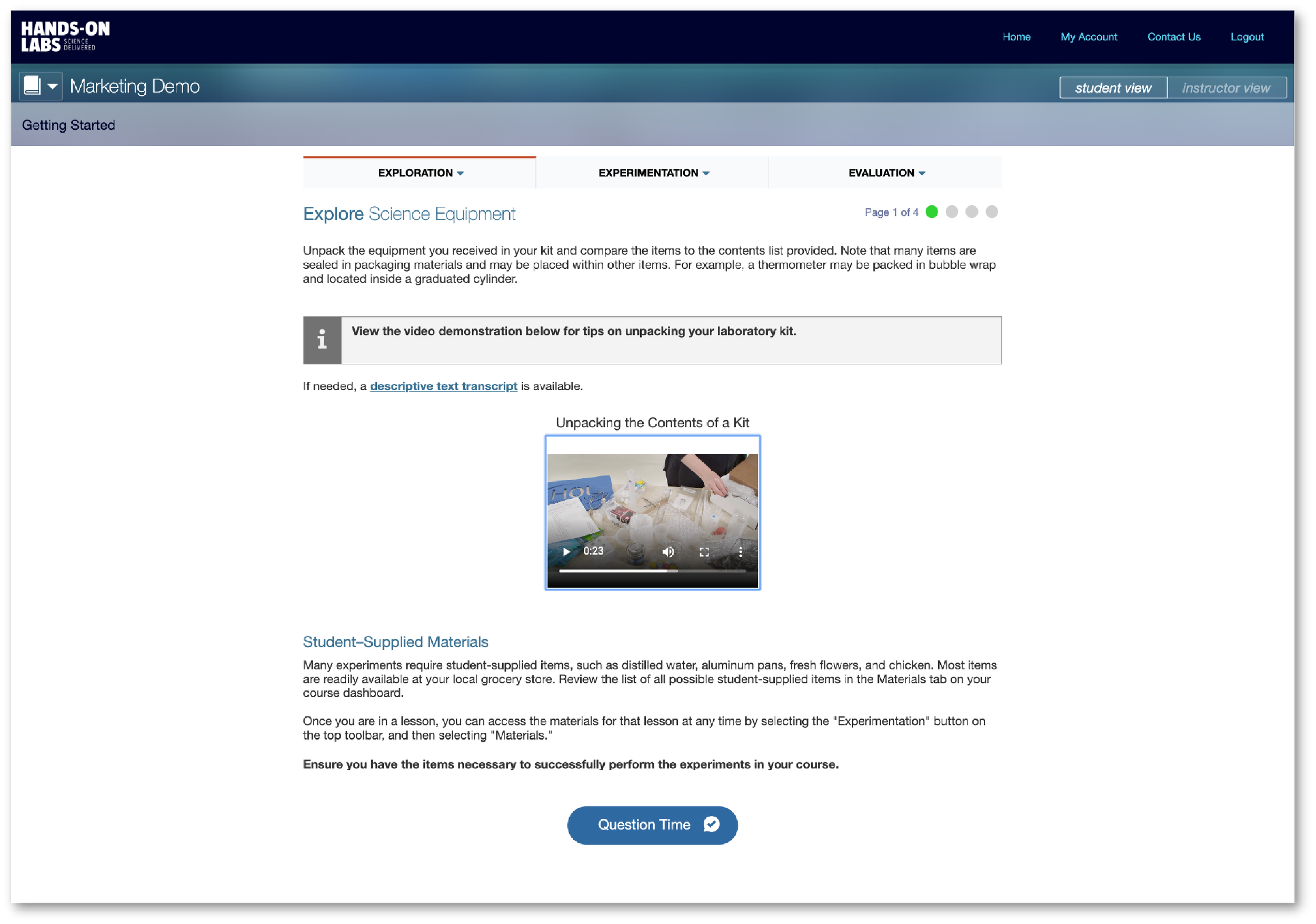
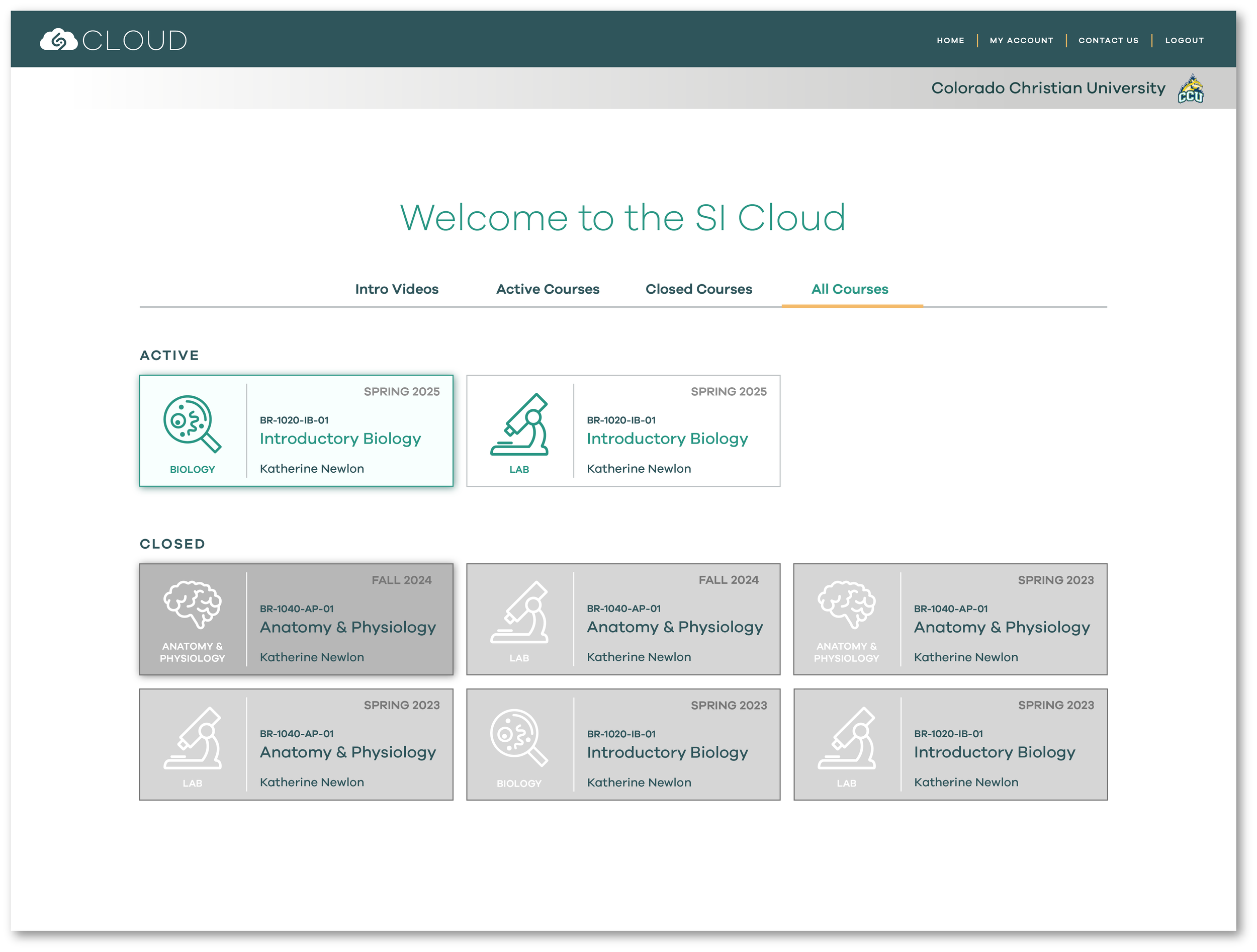
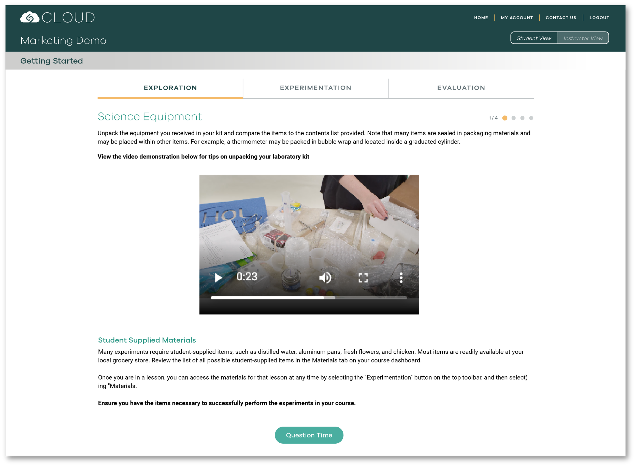
THE “SI CLOUD” STUDENT PLATFORM
Early research revealed that Science Interactive’s physical kits and digital tools felt disconnected, creating friction in the learning experience. To address this, we redesigned the student portal to unify content, workflows, and brand touchpoints into a single, cohesive platform. A consistent application of the visual system reinforced continuity across physical and digital experiences, resulting in a platform that feels integrated and intuitive. In parallel, we evaluated information hierarchy and navigation patterns, and restructured areas of ambiguity to improve clarity, reduce cognitive load, and support comfortable task completion.
BEFORE
BEFORE
AFTER
AFTER
DESIGNING FOR THE ENTIRE JOURNEY
Because the existing order tracker only offered a basic status update and the design did the opposite of inspiring confidence, I reimagined it to reduce uncertainty and provide a clear, confidence-building experience aligned with the broader brand system.
BEFORE
AFTER
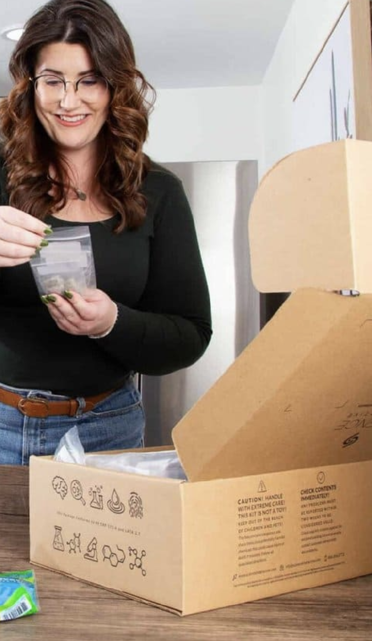
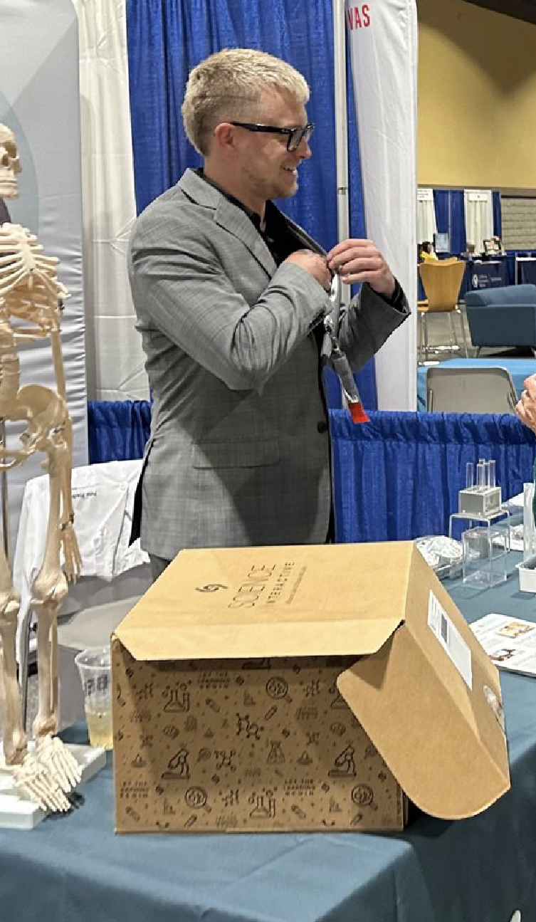
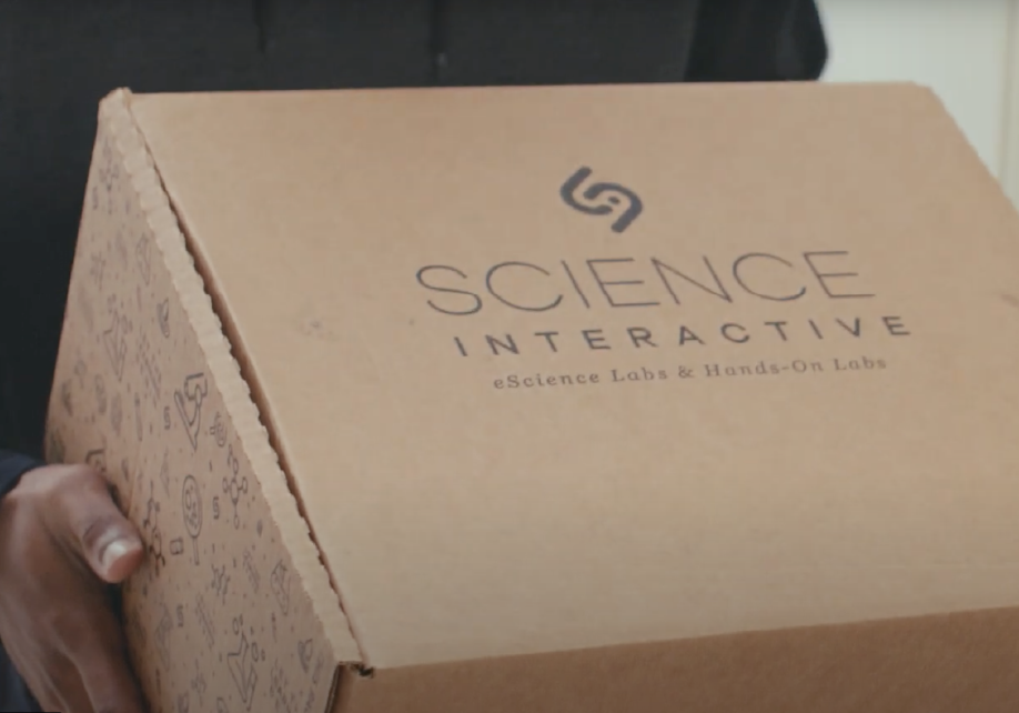
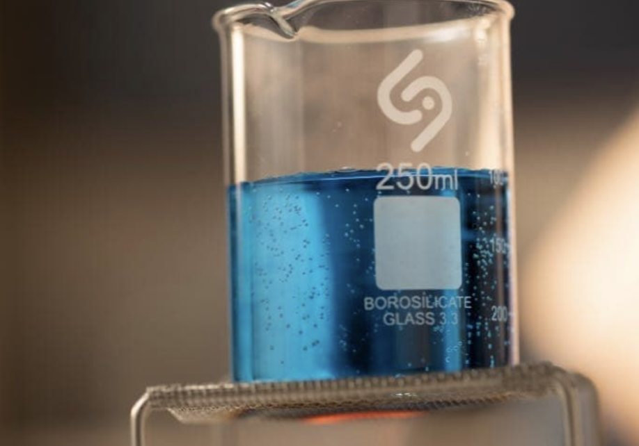
THE PHYSICAL PRODUCT EXPERIENCE
The rebrand extended intentionally into the physical product ecosystem to ensure continuity from digital platform to lab bench. We redesigned the packaging as a functional brand touchpoint, utilizing the color system, typography, and iconography to enhance clarity and recognition. Outdated packaging was transformed into an integrated part of the learning experience through materials students could easily identify, trust, and reference throughout their coursework. This holistic approach reinforces Science Interactive’s brand promise at every physical interaction, aligning credibility, excitement, and hands-on learning into a single, cohesive experience.

OUTCOMES AND IMPACT
OUTCOMES
Following the rebrand, Science Interactive saw a 4x year-over-year increase in customer expansion and new school onboarding.
Improved student satisfaction ratings. Students noted clarity and reduced friction between physical and digital learning experiences.
Professors reported stronger trust through brand expression, leading to more than 100 new colleges buying Science Interactive products within the post-launch year.
Increased recognition in the form of awards and new partnership opportunities, including winning the 2019-20 Cloud Computing Award for the Education Innovation of the Year.
ORGANIZATIONAL IMPACT
Rebuilt momentum across teams by aligning employees around a brand they felt proud to represent.
Enabled future teams to extend the platform, website, and physical materials while maintaining consistency, trust, and clarity.
Reduced long-term design and development effort by providing a clear foundation that supports iteration rather than reinvention.
Positioned Science Interactive to evolve alongside educational technology trends while preserving a recognizable and credible brand presence.
WHAT I WOULD DO NEXT
Validate experience improvements through usage data and targeted usability testing. I would focus on testing navigation clarity, lab completion/ satisfaction rates, and transitions between physical and digital materials.
Increase personalization for different user groups. Study instructor vs. student needs to better support distinct student and instructor workflows while maintaining a consistent brand experience.
Further integrate physical kits with digital guidance. I would increase contextual entry points, such as QR codes and progressive disclosure, to reduce friction and support students in real time during lab work.